

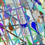
One of the most common works in the water department of CIVILE is the realization of hydraulic simulations using mathematical models such as IBER or HEC-RAS. The main input information to these models are the flow hydrographs: flow values with respect to time. And sometimes it happens that the only information we can get from these hydrographs is an image.

So what do we do now? How do we extract the numerical values from this graph?
In today’s blog post we are going to discover one of the most useful and powerful tools we have found looking for the answer to these questions and we are going to show you how to use it. Its name is WebPlotDigitizer.
What is “WebPlotDigitizer”?
In 2011, Ankit Rohatgi, the author of this tool was facing our same problem. During his chemical engineering studies at the University of Notre Dame of Chicago he often found that the information he needed was only available in graphical format and that the task of extracting the numerical values from these representations was complicated and tedious, and sometimes the results he got were too inaccurate .
Their solution was to create WebPlotDigitizer, a tool capable of automating the extraction of numerical information from graphical representations.
How does it work?
The tool is available as a web application and its operation is very simple. To explain how it works, we will use the image above to extract one of the curves.
Upon entering the application, we are welcomed by the home page, which already shows an example image loaded. From the top menu, we load the image of our hydrographs.

Once we select our image, the first thing the tool asks us is thetype of graph we are introducing. In our case it is a 2D X-Y axis plot.

Next, it asks us to identify the axes in the image by selecting 4 points, two belonging to each of the axes.

Finally, once the axis points have been selected, we are asked to indicate the axis values that correspond to these points. In this case, for points X1 and X2 we have taken values of 40 and 160 and for points Y1 and Y2 the values of 5000 and 25000. Additionally, we have selected the option to omit the rotation correction since in our image, the axes are perfectly oriented.

After these steps, our image would be correctly loaded and calibrated, ready to extract the values.
In this example, we will extract the information from the red line hydrograph.

On the right side of the tool we have the options to extract the values, divided into manual mode and automatic mode. In the automatic mode, we have the option to indicate the color of the line we want to get in numerical format as well as the method of interpolation between the points detected and the distance between the points we want.
In a first attempt, we will select the red color and leave the rest of the options in their default form. With these options, we press the “Run“ button and the result that the tool gives us is the following:

As we can see, the tip of the hydrograph is staying above the points created by the tool, this can be solved by decreasing the distance between points. Going from a distance of 10 pixels to a distance of 5 pixels we can improve the accuracy.

The next step would be to manually add the start and end points of the hydrograph that have not been detected by the tool because they are hidden behind a line of another color. This can be done with the button “Add Point“button in the manual point extraction section.
Don’t worry, we’re almost done
We will add several points on the horizontal axis before and after the automatically identified ones, including one at the origin of the axis and one at its end point to obtain the full extent of the curve.

Once we are satisfied with the points, in the left menu, if we press the button “View Data“button, we will obtain the numerical values of each of the identified points. From here, we have the option to format our data with the menu on the right and several options to export our information: we can copy it to the clipboard or download it as a comma separated data file (csv) that we can import into a spreadsheet.

If we download the extracted values and make a graphical representation of them, we can observe the great accuracy of the data obtained.

What else?
The process we have just gone through is just the tip of the iceberg of WebPlotDigitizer. Its capabilities range from extracting multiple lines simultaneously to analyzing multiple types of graphs such as bar charts, pie charts or triangular diagrams, not to mention the fact that its author is continuously improving the tool, currently in version 4.5.
If you want to know more about WebPlotDigitizer, you can find an extensive manual on its website where all the available functions and how to use them are detailed. I hope you found this blog post useful and that you have added a new tool to your work arsenal.
Written by:
Agustín Hormigo Gutiérrez
Civil Engineer
Civil Engineering Area – Water Engineering Section in Civile


